

DEEP DIVE Keurig | Coffee house experience
FROM MARKET GAP TO EVERYDAY ESSENTIAL
THE CHALLENGE
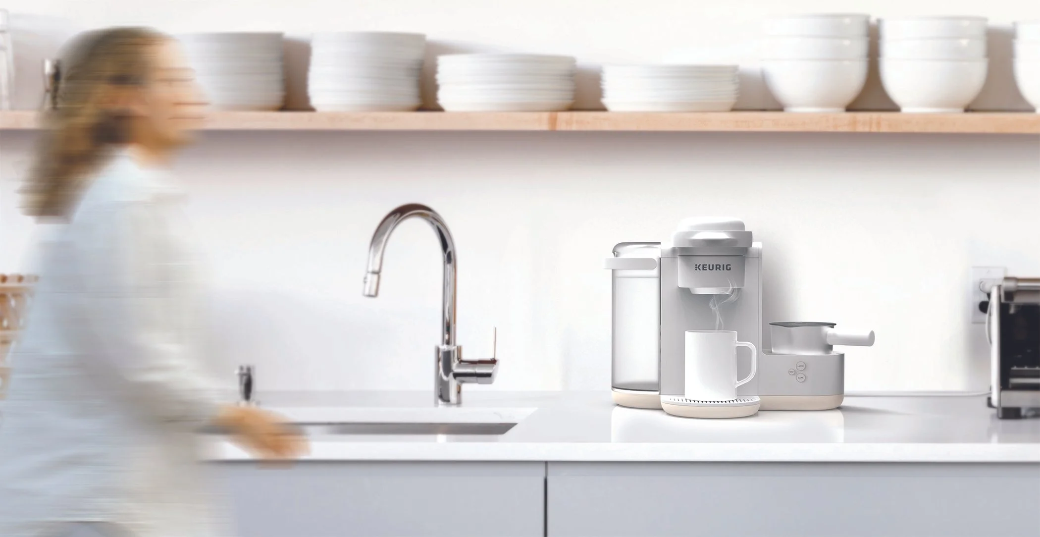
Bringing Café-Style coffee home—Conveniently
Keurig aimed to unlock new growth by tapping into rising demand for café-quality drinks at home. While consumers craved the flavor and variety of specialty coffee, they also expected speed and simplicity—creating a clear opportunity to reimagine convenience in the single-serve experience.
DEFINING PRODUCT DIRECTION
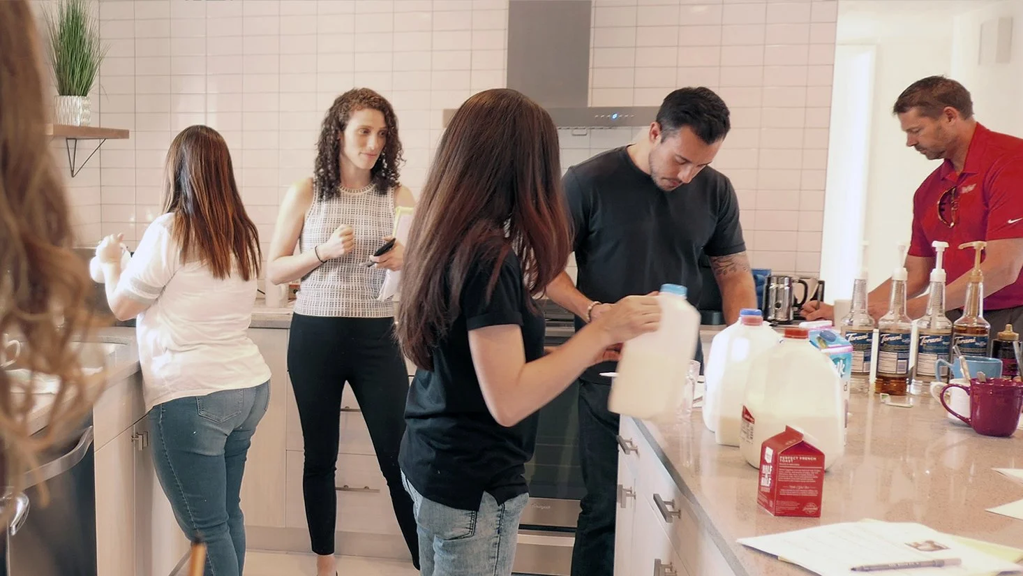
Co-created with consumers in 5 North American markets (US/Canada) to uncover barriers to making milk-based drinks at home—shaping early product direction and driving a test-and-learn approach through iterative prototyping and validation.
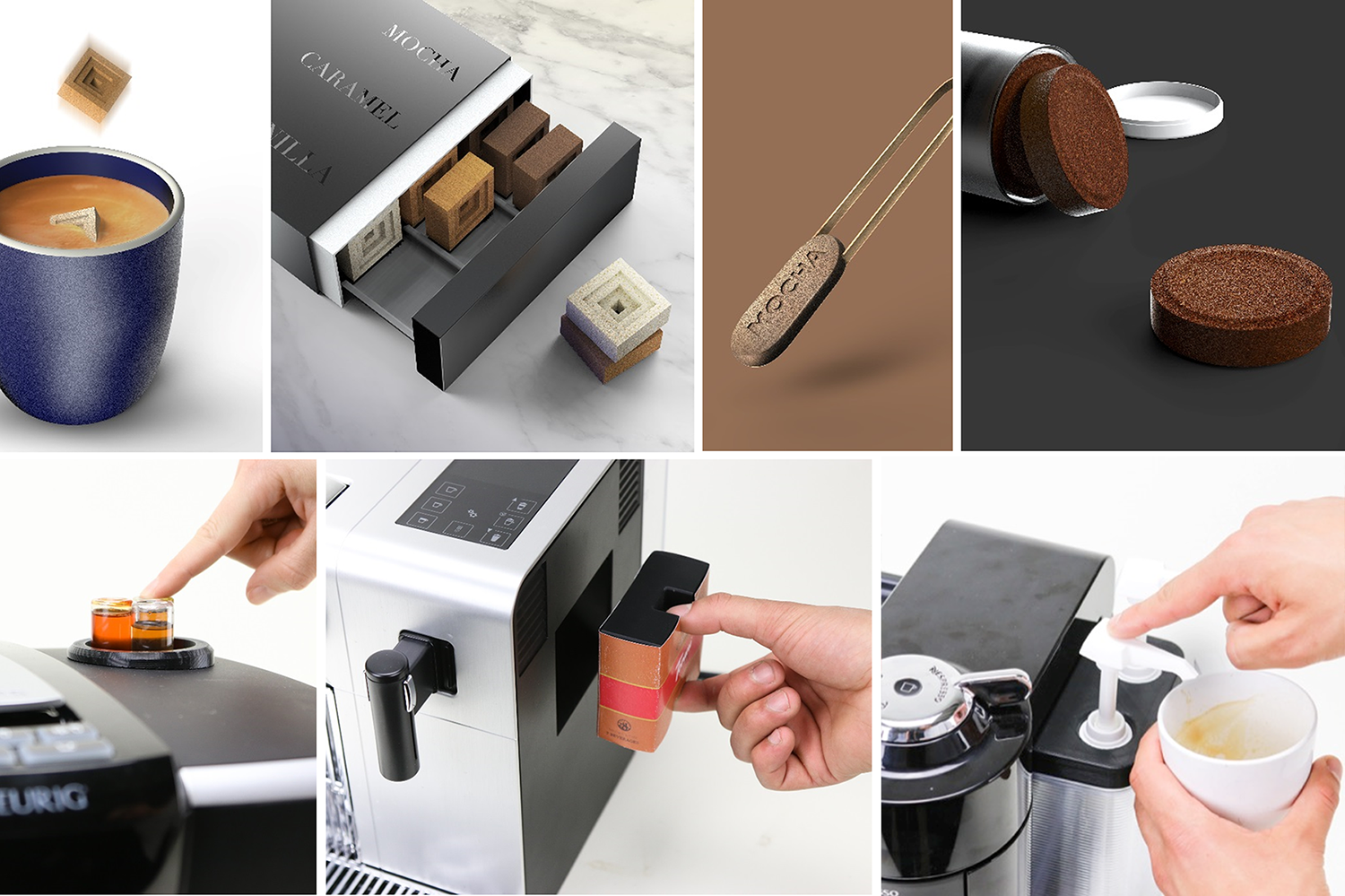
Early testing of coffee, milk, and flavor delivery—using speculative stimuli, 3D prototypes, and hands-on prep with espresso machines—surfaced user challenges and laid the foundation for K-Café
Users care more about how much flavor they add than where it comes from. With no strong preference for integration, the team prioritized simplifying the system by focusing on milk frothing only
With 80% of research complete, product platform, timeline, and MVP milestones for K-Café were finalized
BUILDING THE PRODUCT ARCHITECTURE
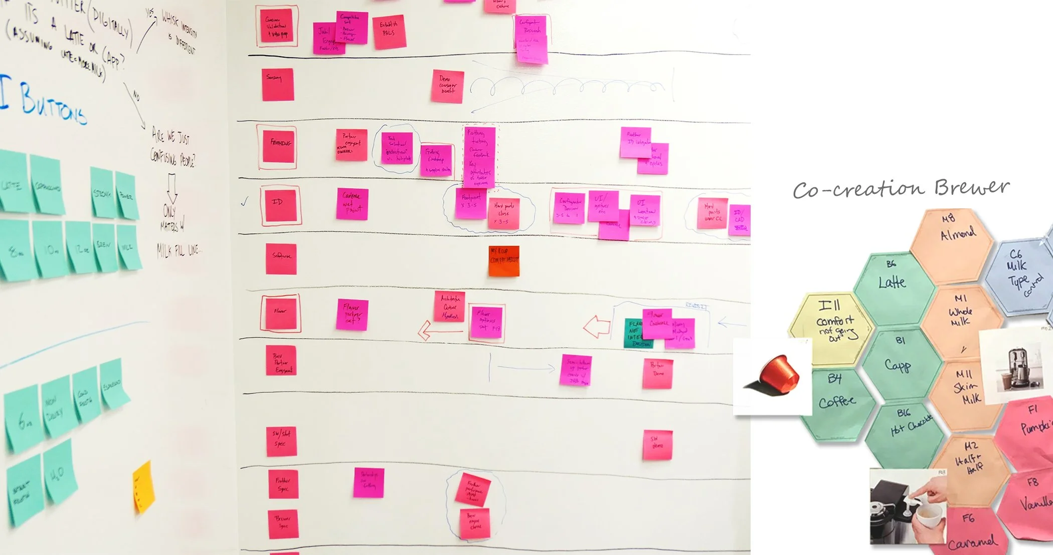
Turned lifestyle and appliance trends into early product architecture and interaction flows—modernizing Keurig’s single-serve experience with barista-style drinks, while testing the location and usability of key touchpoints to preserve simplicity and ease of use.
User testing revealed the need for clarity and reassurance—building confidence at every step while maintaining the convenience loyal users expect.
True differentiation emerged from understanding how users interact with the frother—where it lives, how it works, and when it’s wanted
UI concepts were tested and refined in real time to improve clarity for preparing both single brews and milk-based drinks
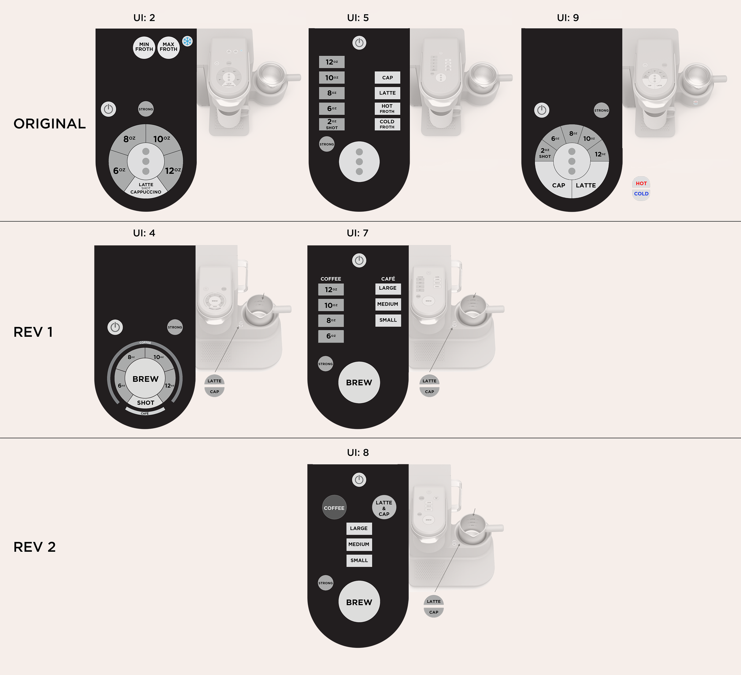
Focus groups with 30 users validated a button-based, T-shaped layout as the most compact and visually clean solution for users
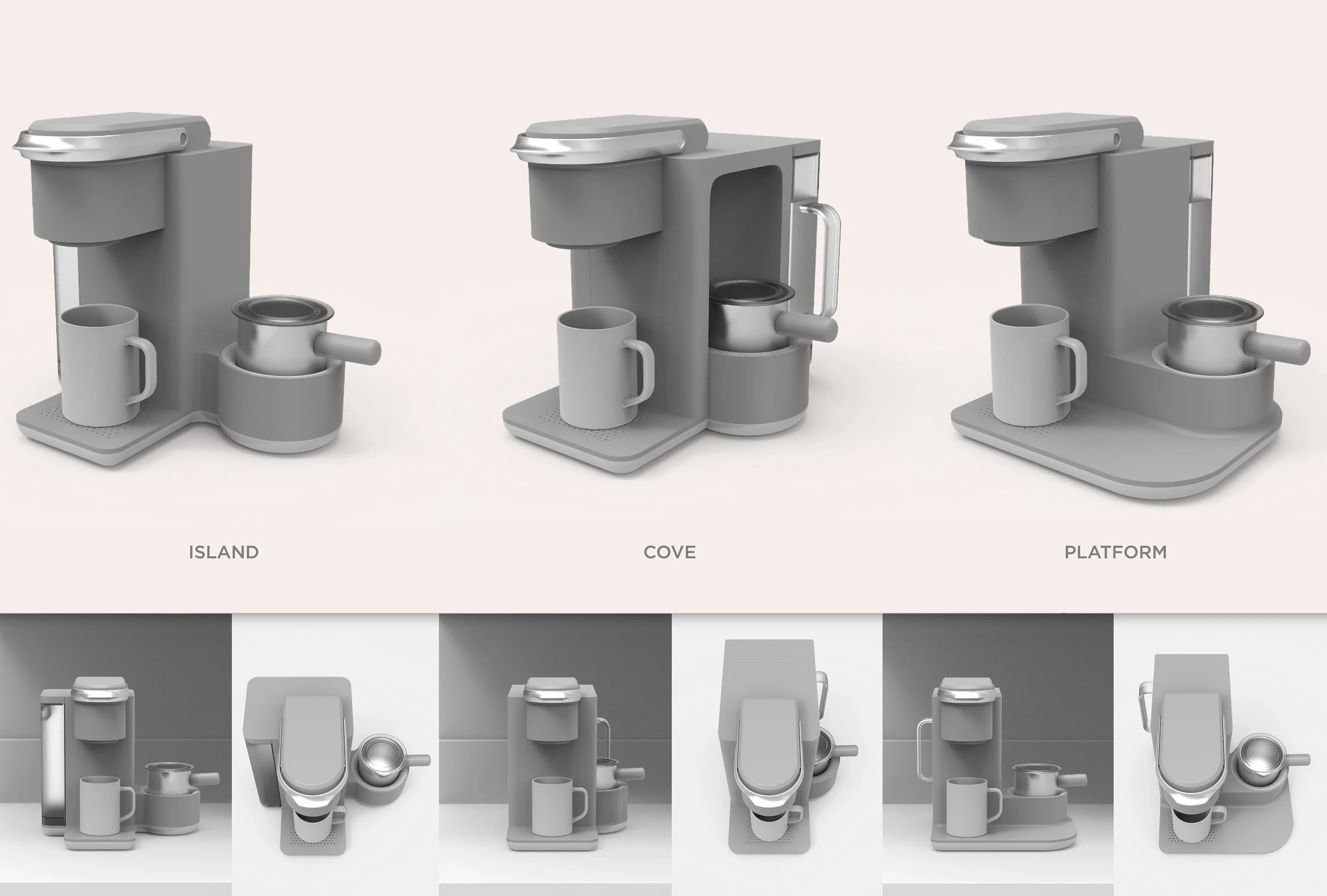
GIVING FORM TO A NEW CATEGORY
With a tested product architecture in place, bold forms were explored to help Keurig stand out and claim leadership in a new category.
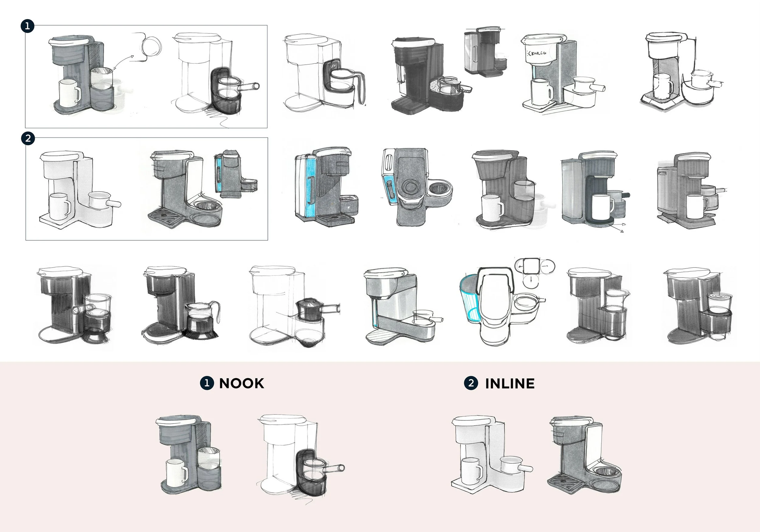
By exploring multiple frother integrations, the team arrived at solutions that balance intuitive interaction with a strong, differentiated visual statement
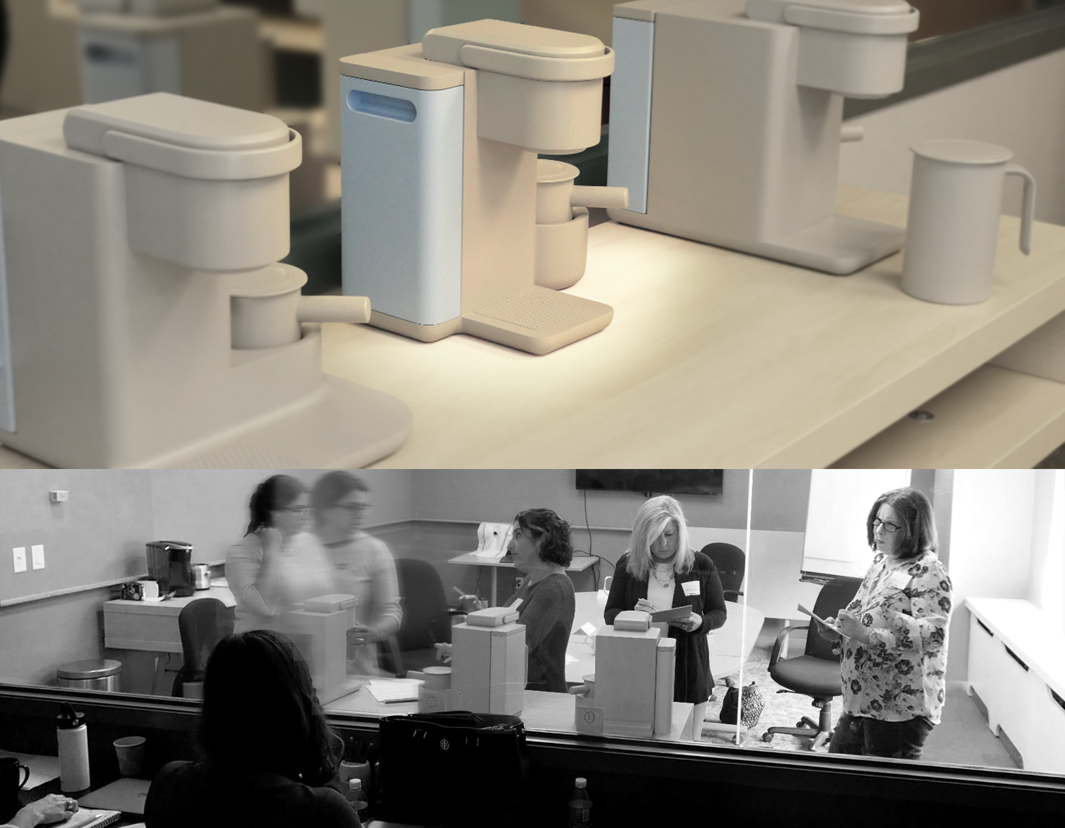
On-site review aligned stakeholders around three final design directions, accelerating buy-in and next-step decisions
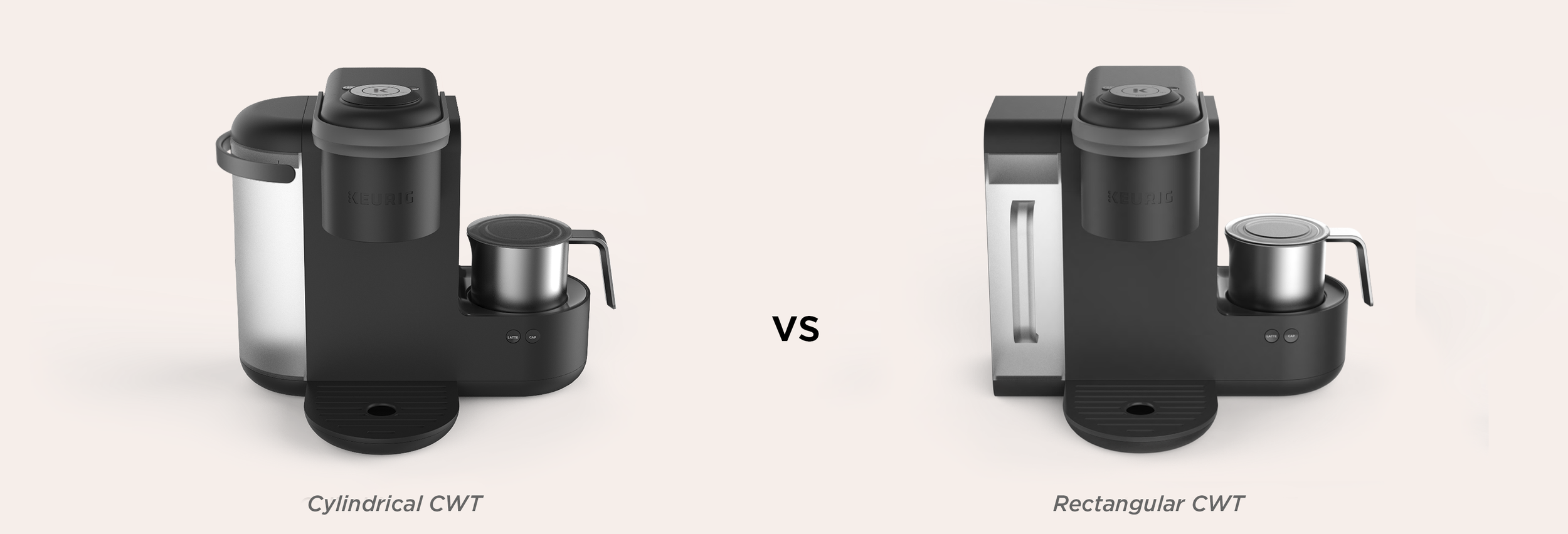
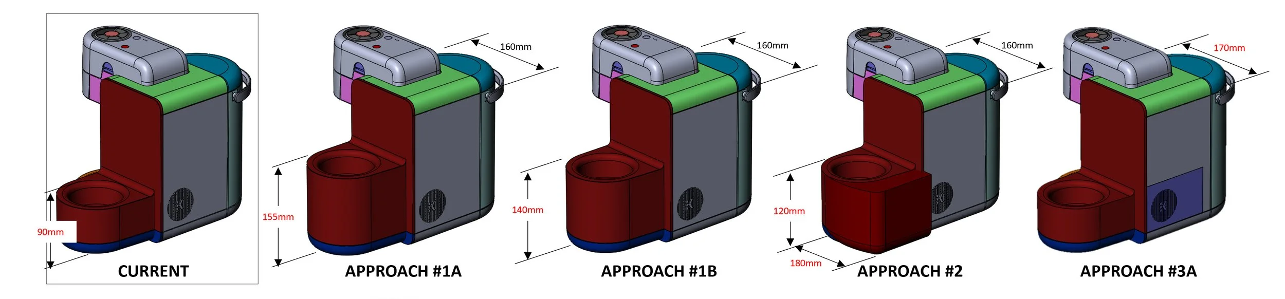
ID down-select centered on cylindrical vs. rounded-cuboid tanks to find the best balance of form and functional integration
The half-cylindrical tank proved more harmonious with the brewer architecture, elevating the milk portfolio expression
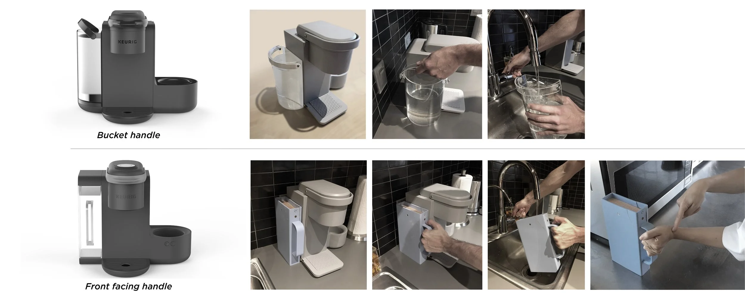
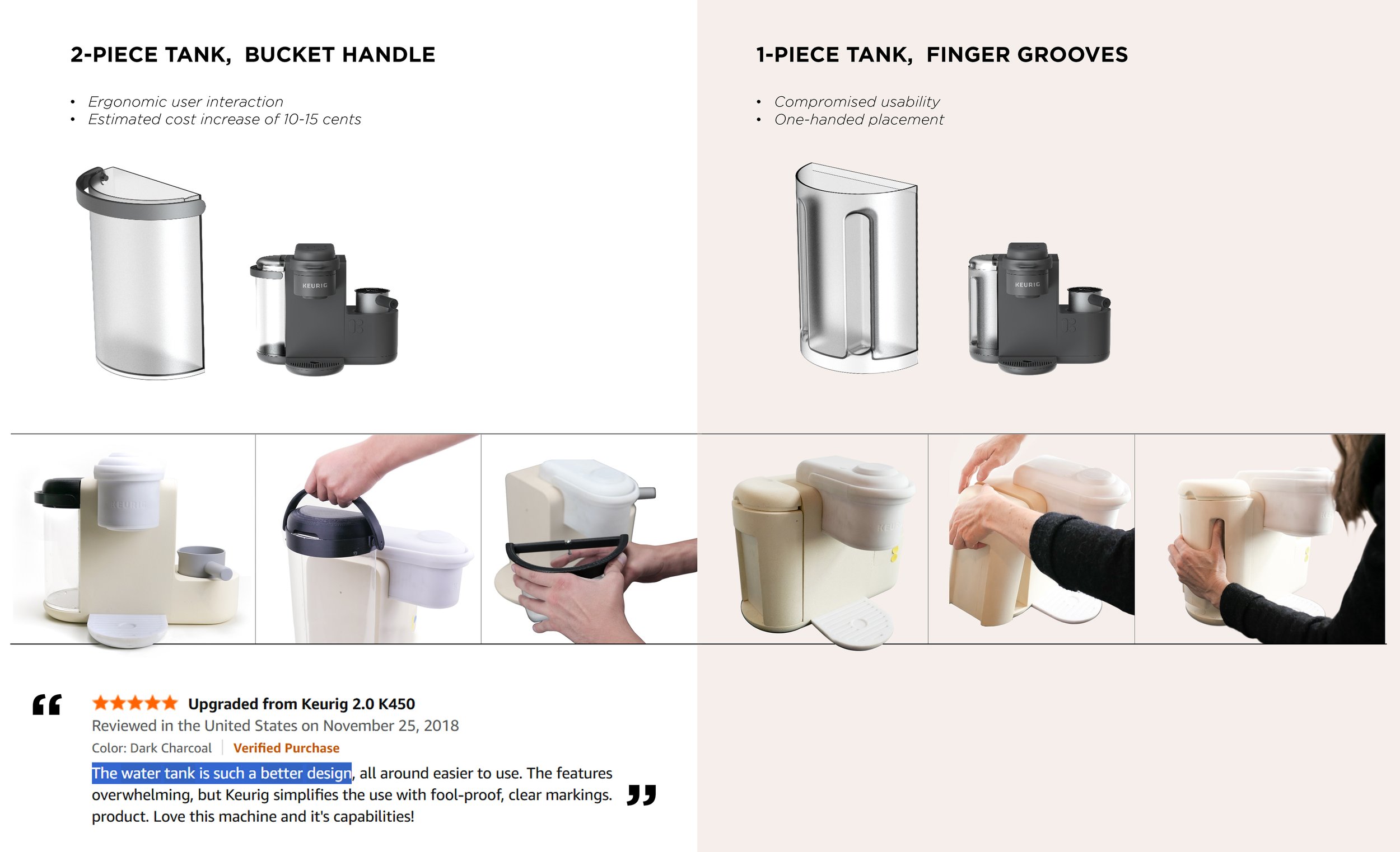
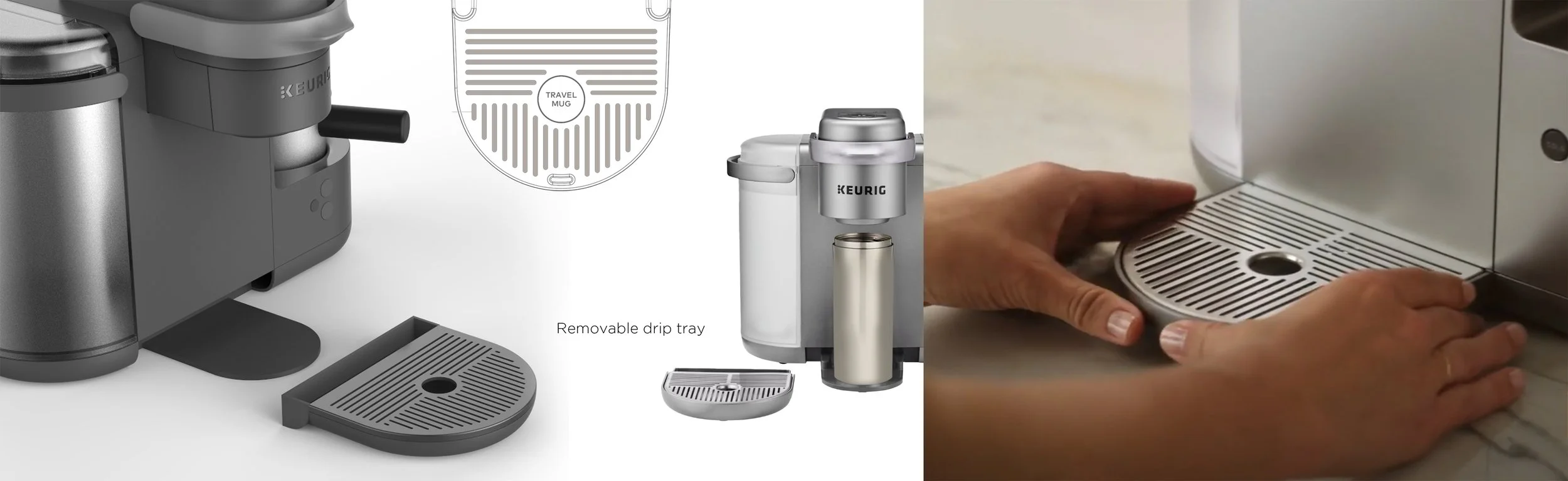
Ergonomic testing favored the bucket-style handle for easier lifting and integration—outperforming the front-facing handle, which requires extra effort to stay level
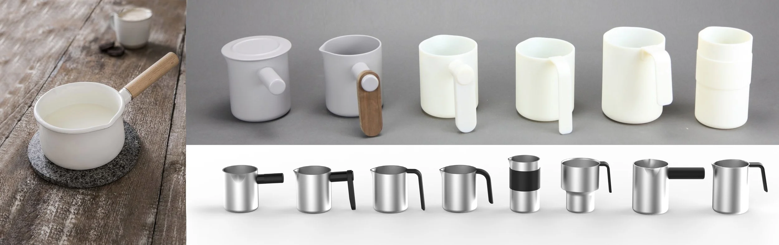
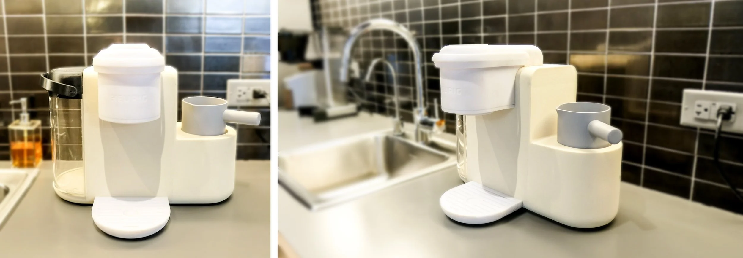
3D-printed milk carafe designs, inspired by the classic milk pan, validated ergonomic ease and nostalgic appeal—strengthening Keurig’s position in the milk-based coffee category
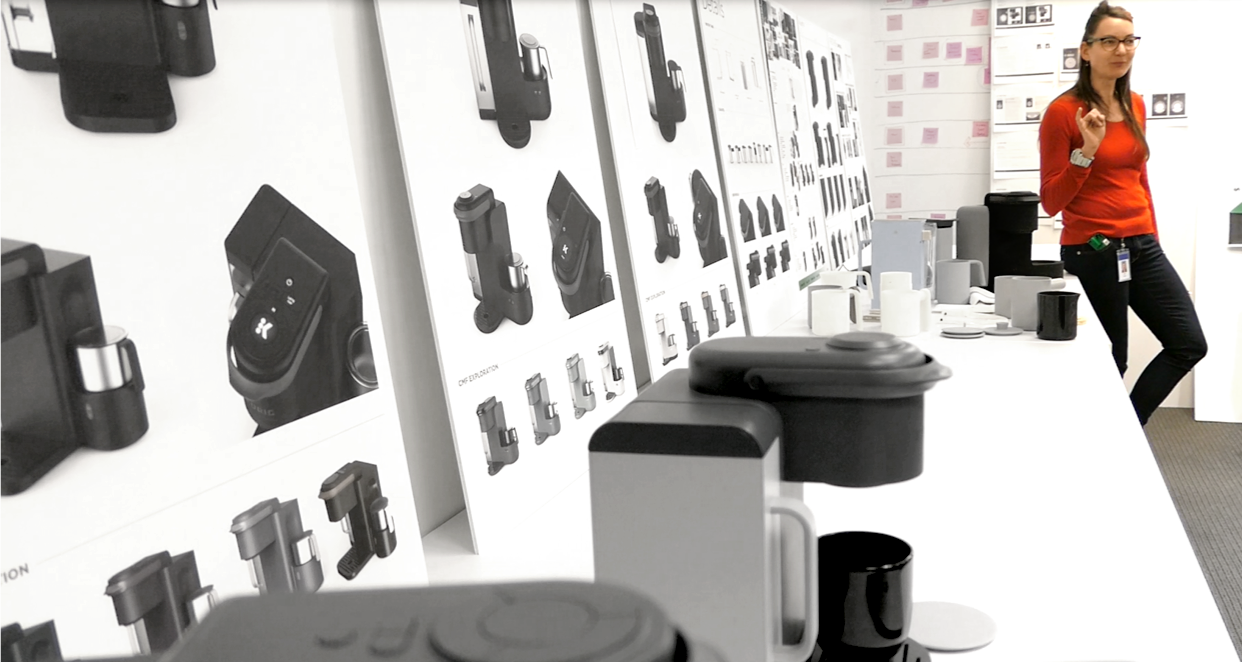
NAILING THE DETAILS WITH WORKS-LIKE PROTOTYPES
Moving quickly into design detailing, frequent testing with users and executive stakeholders was essential to refine UI flow, physical touchpoints, and frother integration—nailing an interaction that felt simple, error-free, and delightful.
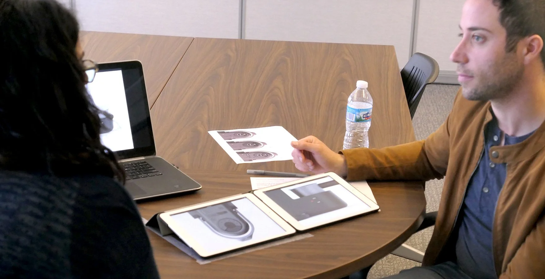
UI & UX Prototyping and testing
The engineering team built works-like prototypes with swappable UI plaques, enabling hands-on “latte-testing” of two interface concepts—brewing real coffee and frothing milk using a modified K80 and simulated frother.

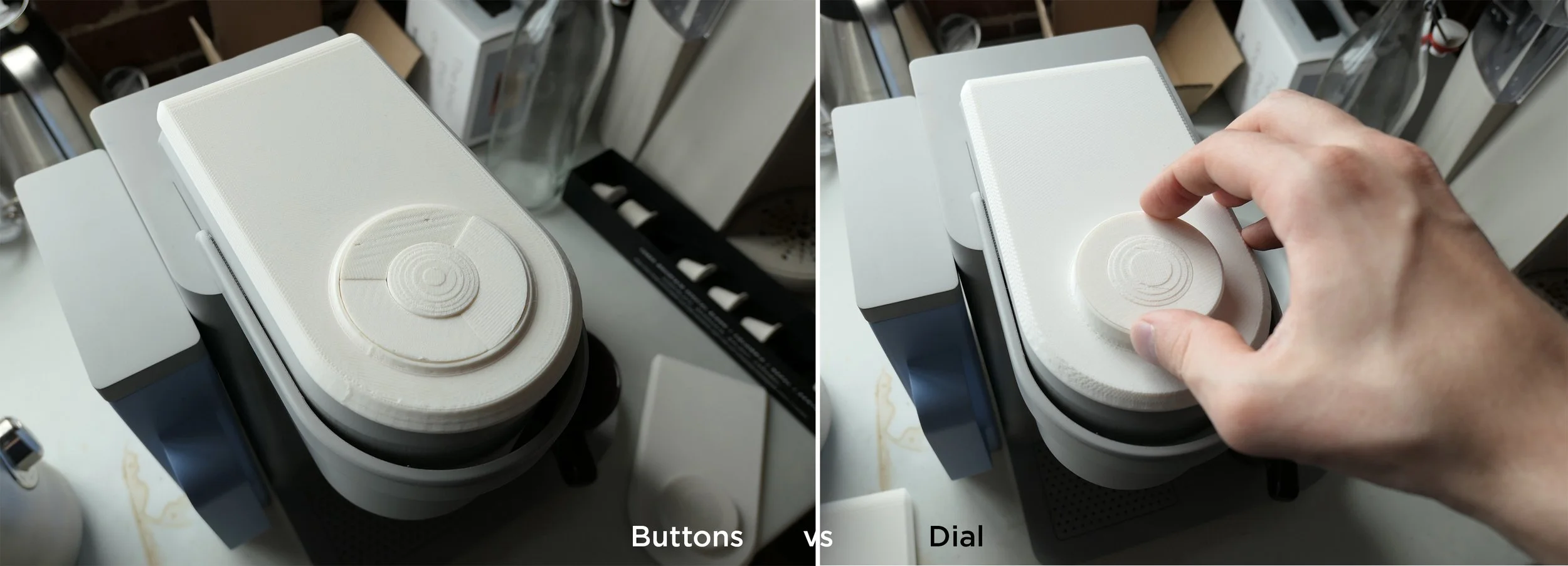
This enabled real-world testing of knob vs. button interfaces, giving Keurig stakeholders firsthand experience to evaluate and align on early design directions

Testing two fundamentally different UI paradigms—Creator (dial) vs. Customer (guided lights)—reveals the more intuitive option, guiding our primary interface choice
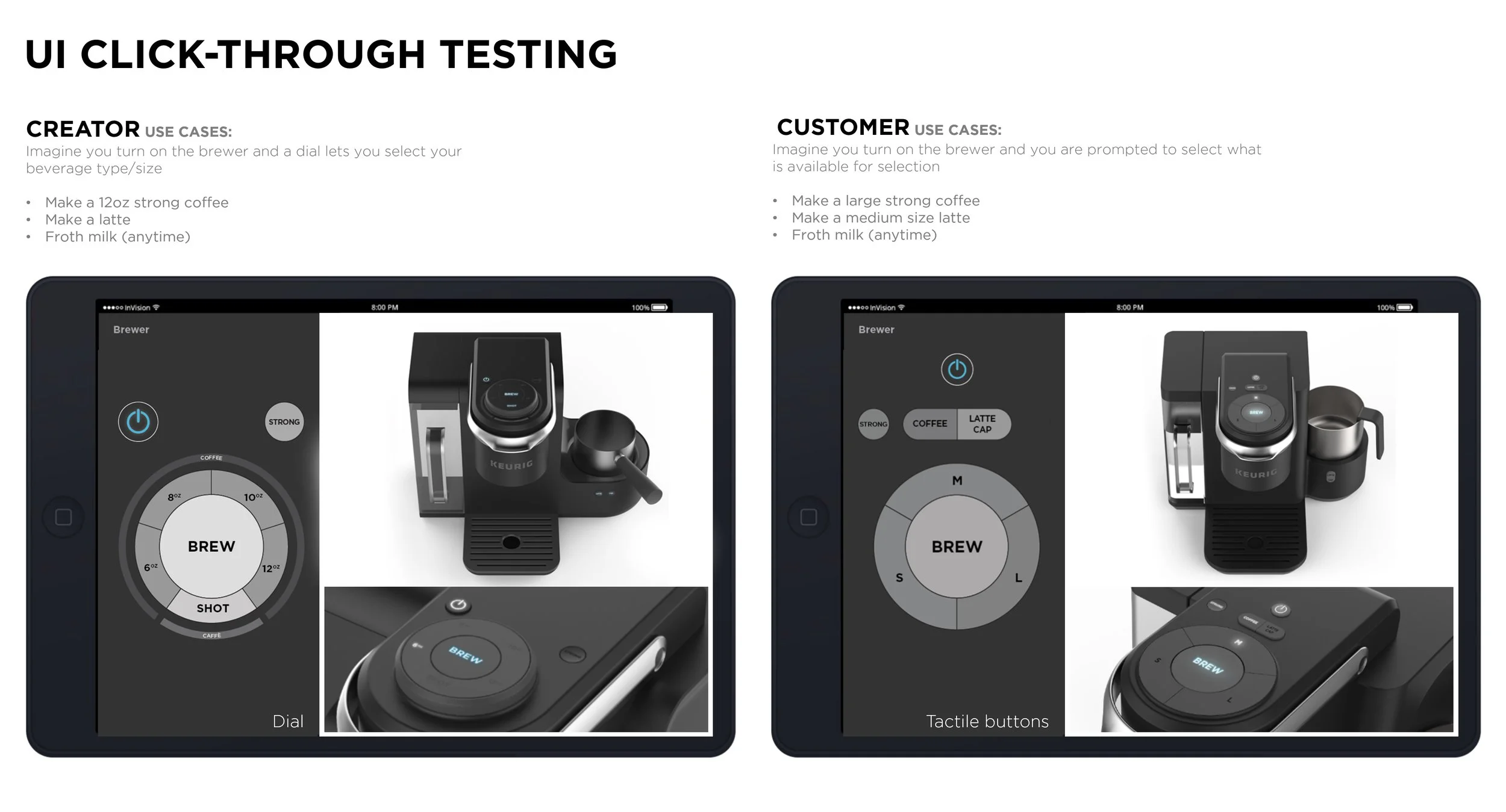
The best elements of both were selected for further development—prioritizing a direct, top-down beverage selection path, supported by hierarchical prompting lights and a button-based implementation over a dial
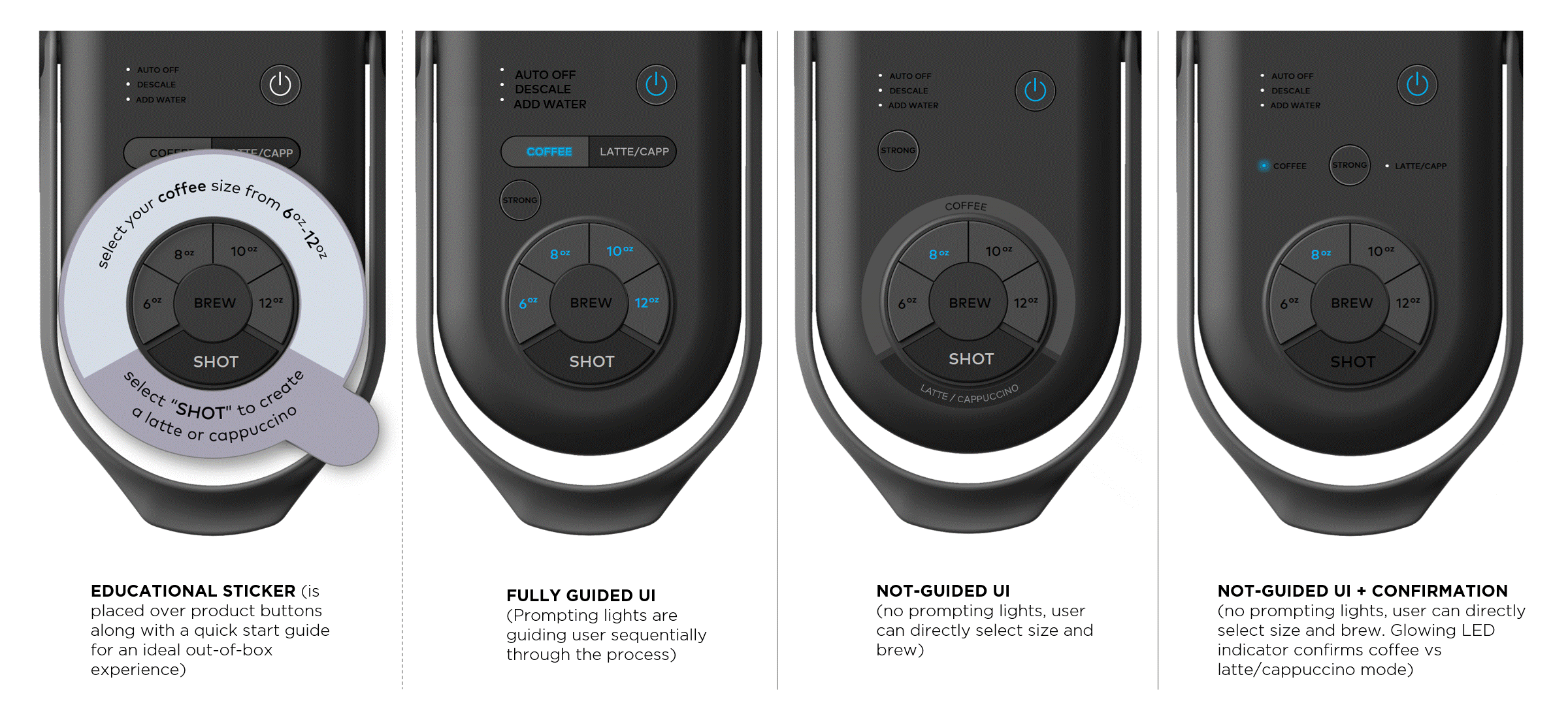
Refined the UI to understand the balance between prompting and direct control, revealing that users value flexible guidance, clear confirmation, and a top-down flow—enabling confident use within seconds, & on the first try
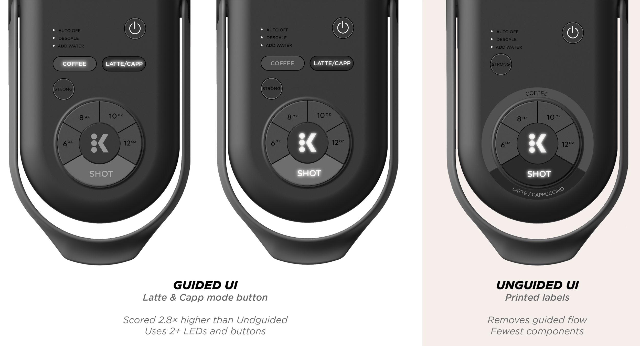
User testing confirmed strong preference for a flexible Guided UI that allows advanced users to skip drink type and go straight to selecting shot or ounces—driving leadership alignment to finalize and spec it as K-Café’s primary interface, delivering on Keurig’s promise of simple milk-based brewing
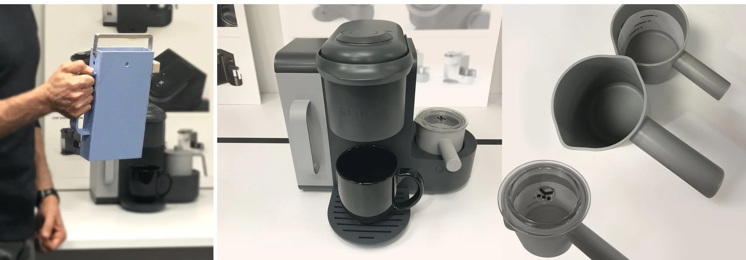
Navigating cost versus usability trade-offs
User testing revealed that removing the bucket handle—an essential touchpoint—offered negligible cost savings but significantly compromised usability, reinforcing the decision to keep it.
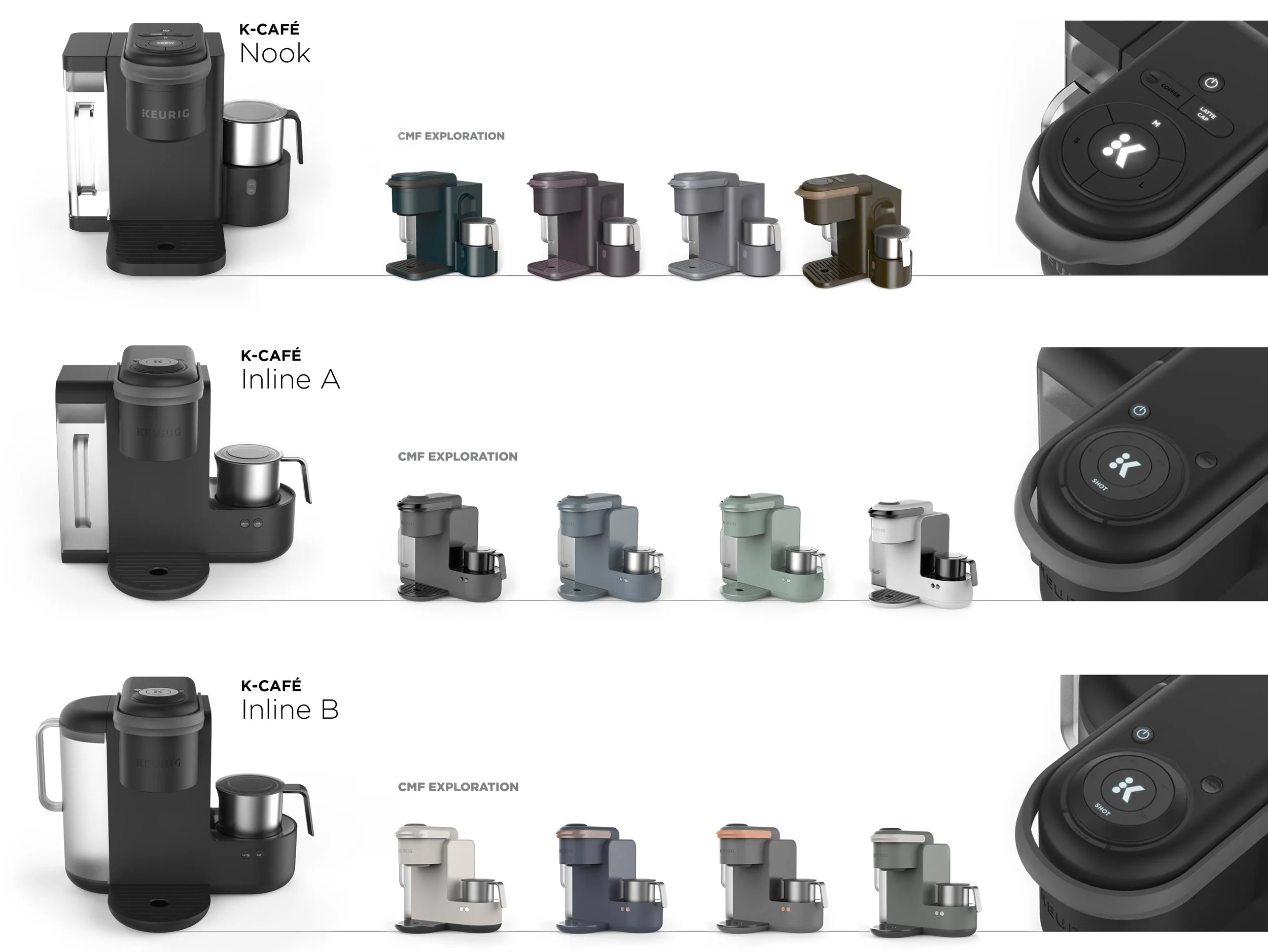
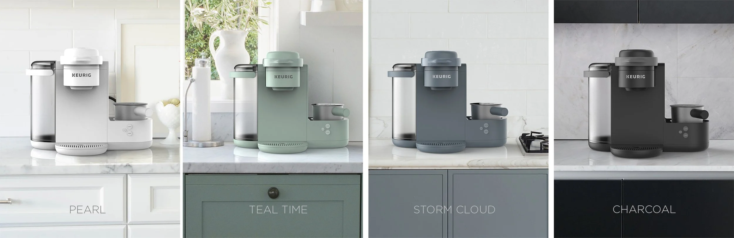
Colors, Materials & Finishes (CMF) Opportunities
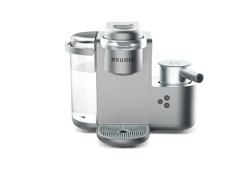
Launched an all-silver special edition and an all-charcoal CMF to offer a familiar yet elevated entry into milk-based coffee making
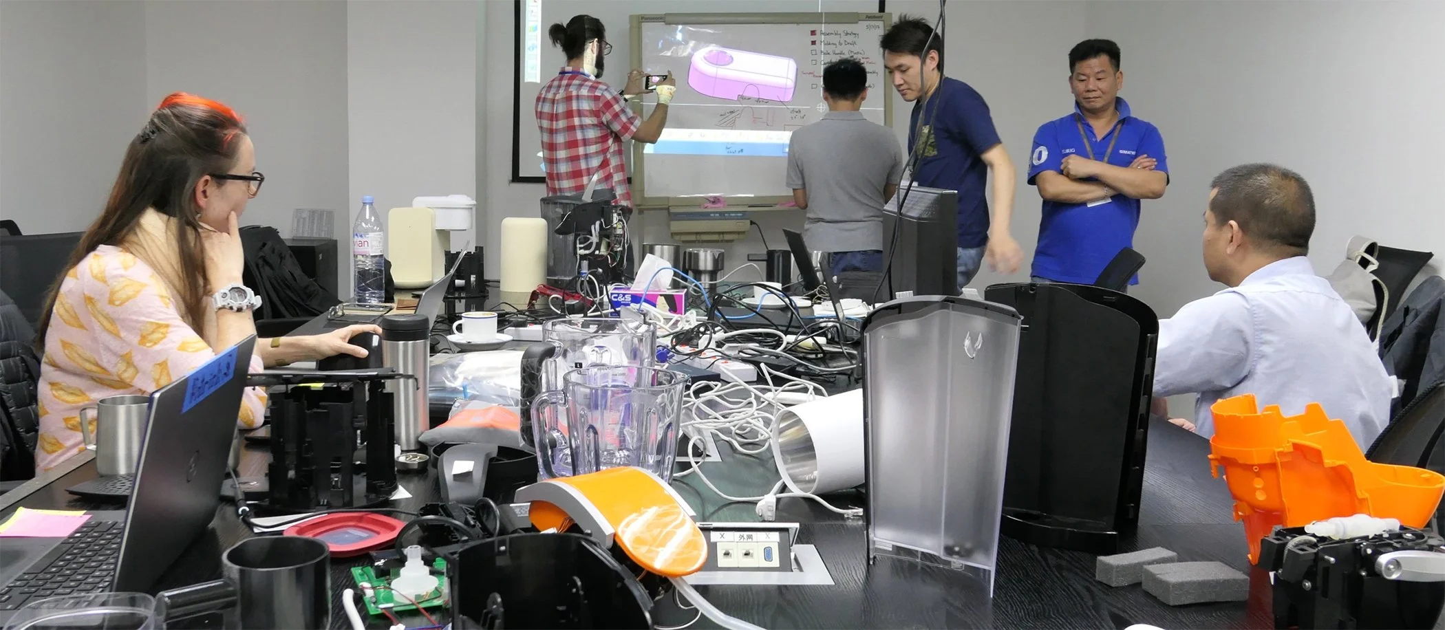
SOLVING CRITICAL ISSUES ALONGSIDE MANUFACTURERS
Four days of on-site collaboration with contract manufacturers’ engineering team in Shenzhen led to major breakthroughs in assembly, molding, and detail design—accelerating design-for-manufacturing while preserving user-focused industrial design.
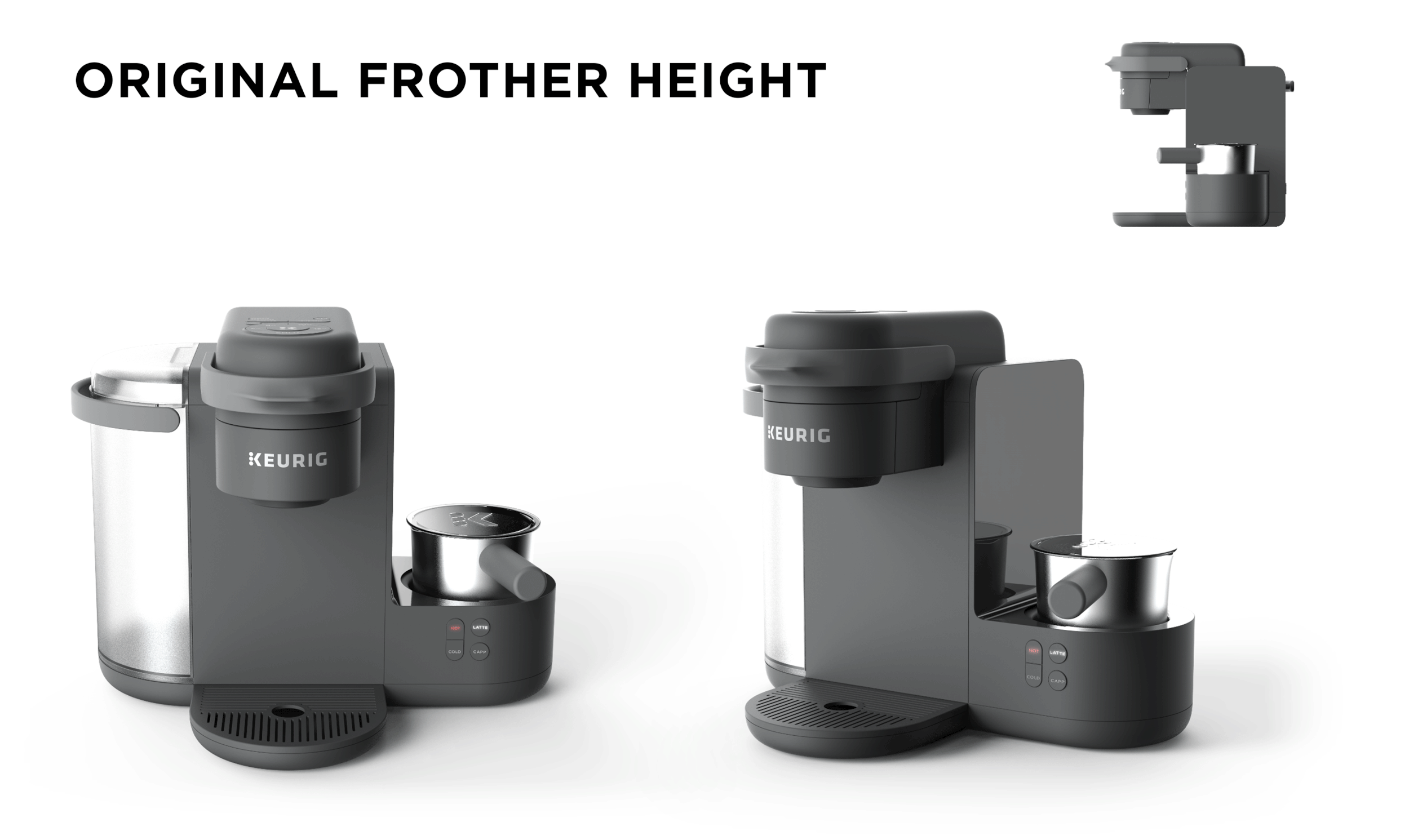
Chose increased frother height to enable future upgrades without retooling (using existing PCB and internals, e.g., coils)—minimizing long-term costs and unlocking design flexibility
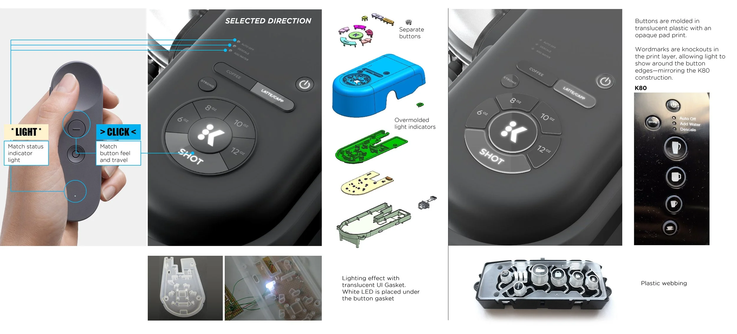
Lighting effects, button feel, and travel were benchmarked against reference products. Light bleed was fine-tuned by adjusting surface texturing, paint, and increasing UI gasket thickness for improved diffusion
Developed a detailed use case framework that shaped brewer and frother interaction logic—used as a living blueprint for programming, UI behavior, and exception handling

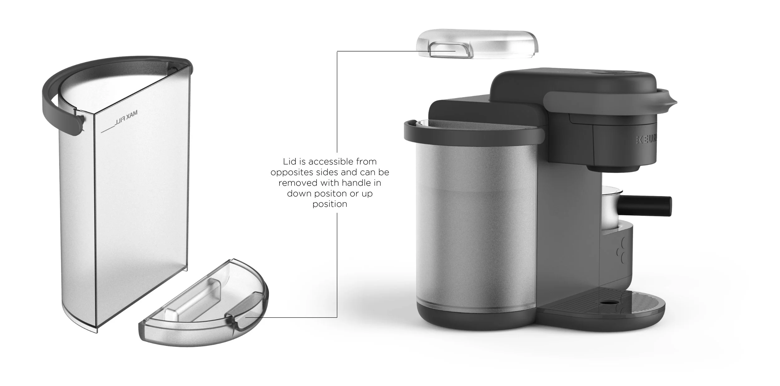
The cold water tank lid includes a rear handle that makes removal easy when refilling at the sink, greatly improving the water tank refill experience
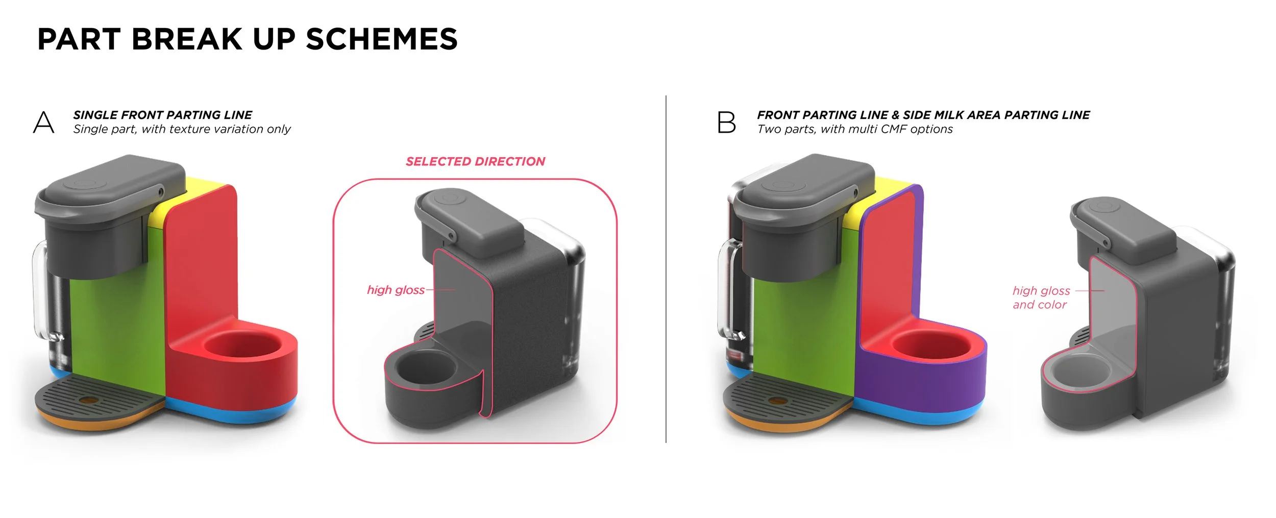
Prioritized a single front parting line to manage texture transitions—creating subtle visual contrast without added color complexity or visual busyness

Statement by the Jury
K-Café is characterised by an elegant appearance. It convinces functionally with its ability to prepare versatile coffee specialities.
WHAT PEOPLE SAY
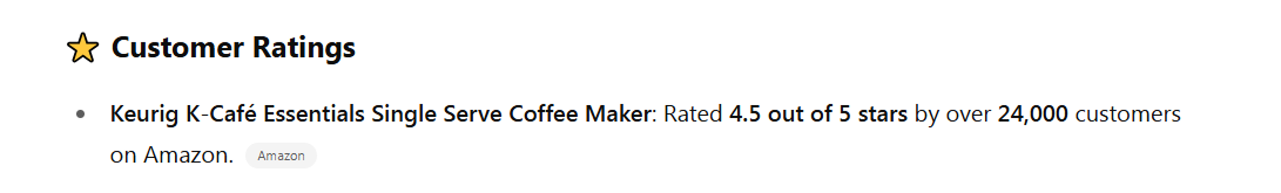
“The original pod coffee company has created an ace latte and cappuccino machine… Clean, minimalist design. K-Cup compatible. Strong and Shot options make a decent espresso-like drink. Has an incredibly easy-to-use, easy-to-clean automatic frother. Mug-friendly. Large water reservoir.”
-John D.

In 2017, I led industrial design and spearheaded UI/UX for a new-market product, aligning design, engineering, and consumer insights to launch a new-to-category solution in 6 months—balancing design intent, manufacturability, and user needs.
TEAM
Creative Leadership & UI/UX Design
Lea Kobeli (Creative Project Lead) – Led design strategy, including industrial design, and spearheaded the brewer's UI/UX development
Industrial Design
Eddie Licitra, Colton Sanford, Germain Verbrackel, Marie Noury, Lea Kobeli (Project Lead)
User research & Validation
Sona Patadia-Rao, Naomi (Kieser) Guthrie, David McGaw, Dane Anderson, Dave Hoffer
Mechanical Engineering, Works Like Prototyping & DFM
Patrick Summers, Alex Dakin, Art Sandoval, Bob Lane
Project Management
Rob Loughlin, Vijay Sekaran
Business Development
Jan Henrich, Brian, O’Neill, Ildefonso Silva, Jeff Salazar
CREDITS
Designed by McKinsey Design
Media Credits McKinsey Design, Leslie’s
AWARDS
Red Dot Design Award 2020
This project is presented for portfolio purposes only and is not affiliated with or endorsed by any company. All rights reserved.

Back to Overview
Next: Genome sequencing portfolio